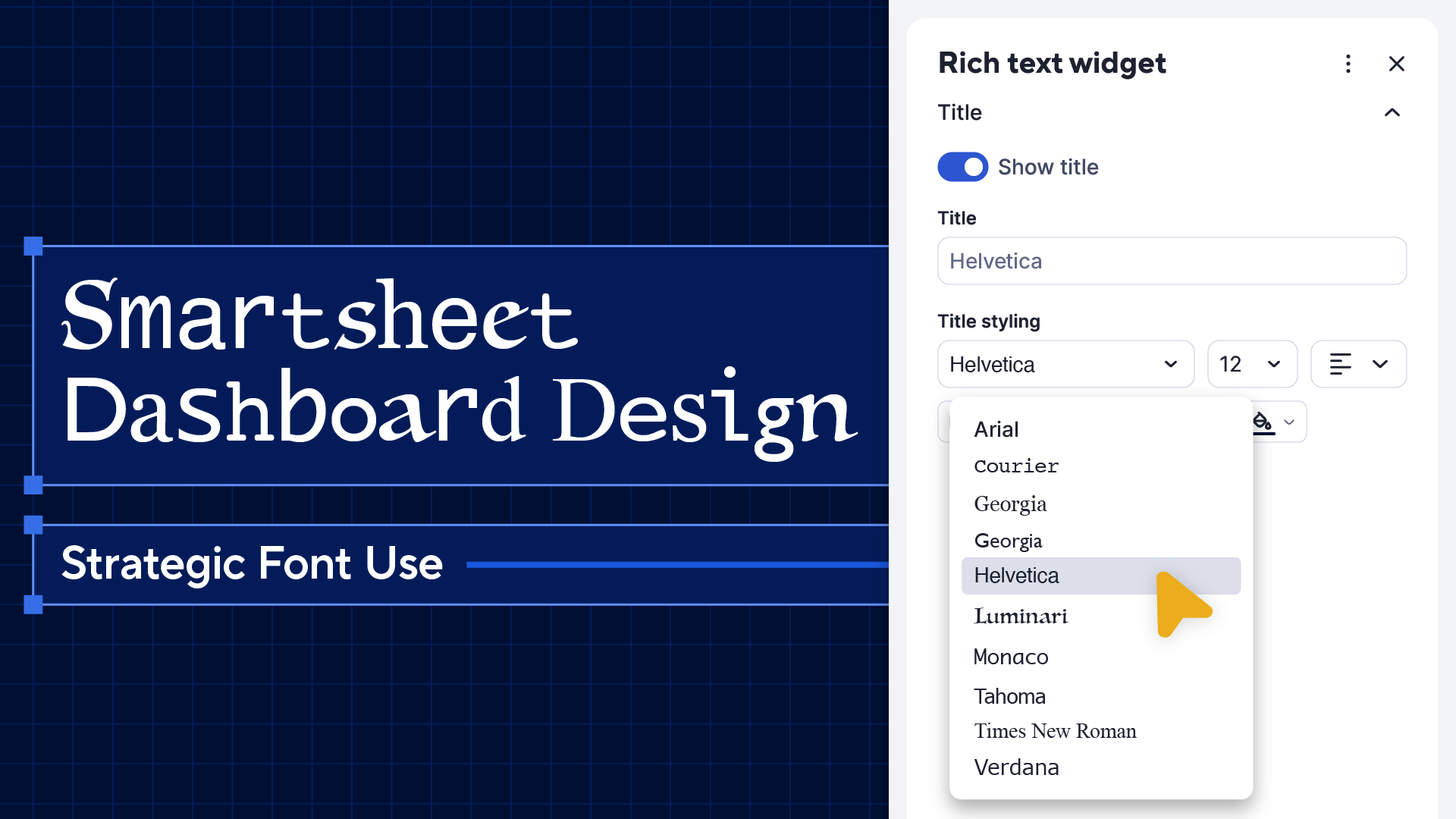
Welcome back! Continuing our insightful journey through dashboard design, we're venturing ahead into strategic font use.
Much like colors, fonts possess the profound ability to captivate and guide the viewer's eye, ensuring information is communicated clearly and effectively. Selecting the right font can be the difference between a dashboard that merely displays data and one that tells a compelling story.
If you’d like to skip to the end to see which dashboard fonts we recommend, click here.
But, if you want to first delve deeper into this pivotal aspect of dashboard design to understand how fonts can transform your dashboard from good to exceptional, onward to the world of typefaces!
A brief note on the history of fonts
Before the 15th century, scribes painstakingly crafted manuscripts by hand, but Johannes Gutenberg’s movable type revolutionized printing, making mass production of texts possible.
The Renaissance brought typefaces that mimicked elegant handwriting, while the 17th and 18th centuries saw a shift towards clarity and standardization, driven by the Enlightenment and Industrialization.
In the 19th century, expressive typefaces emerged during the Romantic era, but the 20th century's Modernism prioritized simplicity, leading to the rise of sans-serif fonts.
Today, the digital age offers a vast array of fonts, empowering everyone to choose from countless options with just a click.
Three general principles
The democratization of typography means that anyone creating text-based content for an audience—such as a Smartsheet dashboard—should be skilled in understanding and harnessing the communicative power of fonts.
Every font tells a story, conveying emotion, setting the mood, and giving the content a distinct tone.
So, how does one navigate this sea of typefaces to select the one that aligns perfectly with the intended message? Well, by reading this blog post. ;)
No, but seriously. We’ve established foundational principles that will help guide you to the perfect font(s) for your dashboard.
1. Contrast communicates
In the design world, a silent communicator often speaks louder than color, shape, or size. This unsung hero is contrast. At its essence, contrast is differentiation. When you have more than one element, contrast emerges, making features distinct and memorable. But contrast is not just about visual appeal; it's a tool for communication.
Think of a lighthouse against an expansive sea – that's the illustrative power of contrast in typography. It's not just about juxtaposing light with dark or thick with thin. It's a thoughtful orchestration meant to guide the viewer's gaze seamlessly.
By pairing robust fonts with lighter versions, a visual hierarchy emerges, spotlighting key sections while ensuring secondary details find their rightful place.


In dashboard design, contrast's importance is amplified. Amid complex data, contrast ensures clarity and crafts an intuitive user experience.
As you refine your dashboard's typography, recognize contrast as more than an aesthetic choice; it's a strategic communication ally, adeptly guiding, emphasizing, and narrating.
2. Emphasis elevates
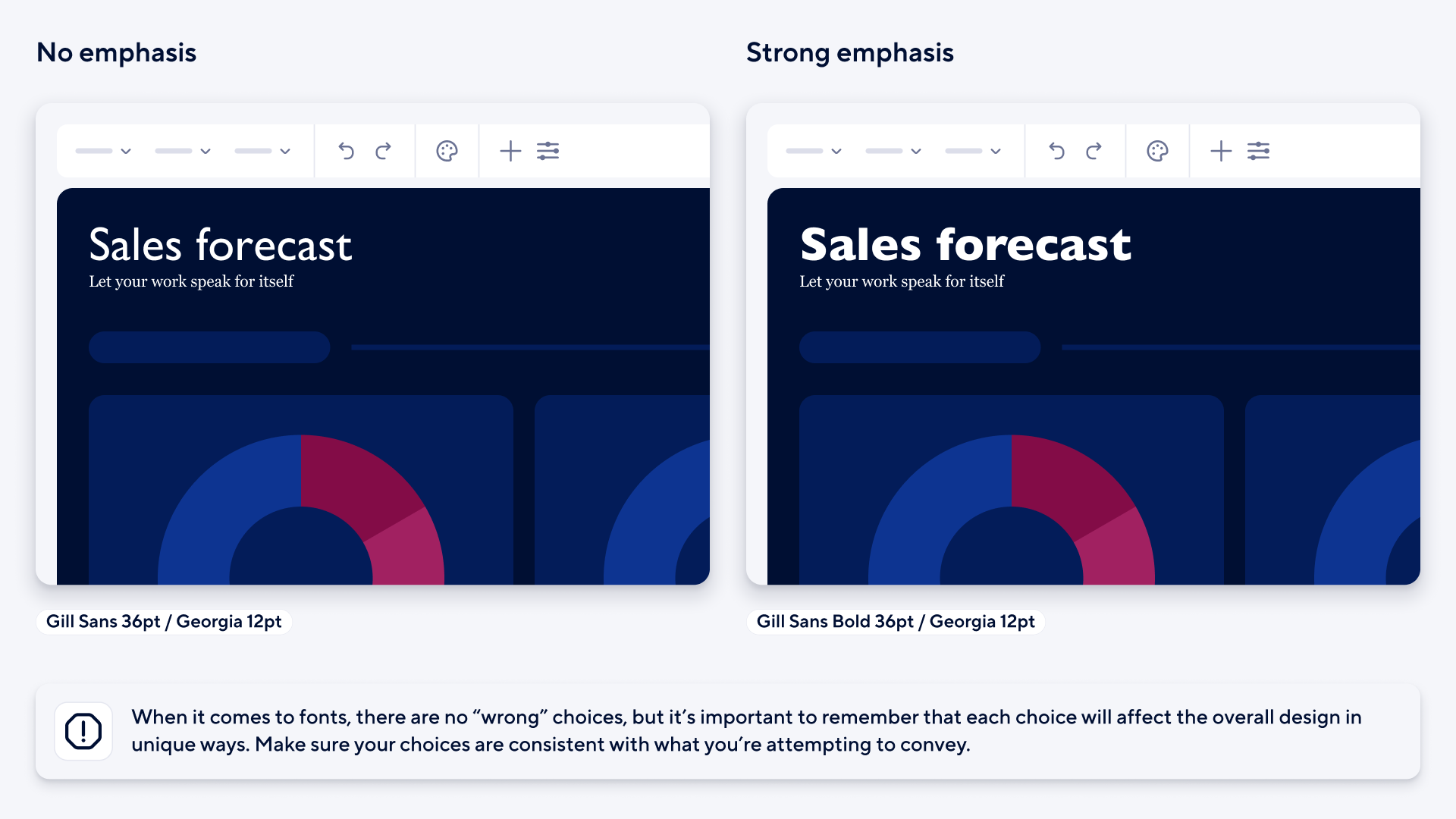
When you're designing your dashboard, think of emphasis as the secret sauce. That little extra oomph that makes your content pop. Play around with the ‘bold’ setting for a few minutes and you'll see what I mean.
There's a world of difference between "Serious business" and "Serious business." The latter has more drama, right? Lighter and heavier weights can subtly distinguish between levels of importance or categories of data, enhancing clarity without overwhelming your dashboard viewers.
A standout word in a sentence or a highlighted sentence in a chunk of text can put your readers eyes right where you want them.
Speaking of drama, have you ever noticed how using ALL CAPS feels like someone's yelling at you? Unless you're trying to make a VERY LOUD POINT, it may be best to keep caps lock off. A change in font-weight can probably say it better anyway.
Size is another neat trick up our sleeves. A big, bold headline is like rolling out the red carpet for your data. But like all good things, moderation is key. Too much big text is like everyone trying to talk over each other at a party.
So, as you elevate your Smartsheet dashboard, remember to sprinkle in some emphasis. This nuanced approach to typography will add depth and sophistication to your design, making your dashboard more visually appealing and effective in conveying information.
3. Content and form align
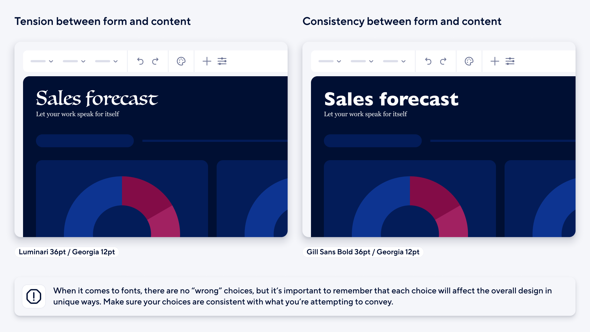
Designing with typography is like assembling an outfit for a big meeting: the message (or attire) is essential, but how you present it can change the whole vibe.
Take our "Serious business" example again. Swap out its typeface, "Serious business;" suddenly, it's the difference between a tailored suit and clown costume. When picking fonts, it's all about setting the right mood and ensuring it vibes with your brand.
Not all fonts are created equal
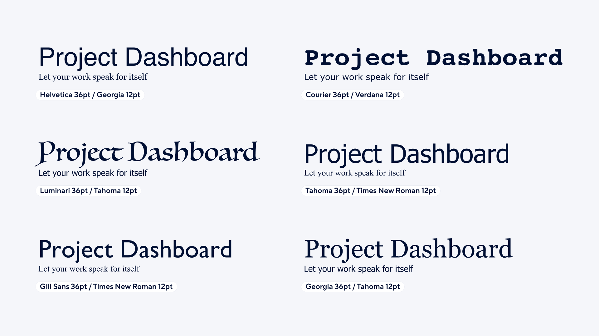
By now you’ve likely come to the correct conclusion that different fonts have different purposes. So with that in mind, here are our recommendations and the best use, pairing and application of Smartsheet dashboard fonts.
Conclusion
With these insights in hand, you're now equipped to choose fonts that not only enhance the readability of your dashboard but also reinforce its overall tone and purpose. By selecting the right typography, you can ensure that your dashboard communicates its message effectively and aligns with the specific style and branding you're aiming to achieve.
We hope you enjoyed exploring the wonderful world of fonts with us - until next time!
