Welcome back!
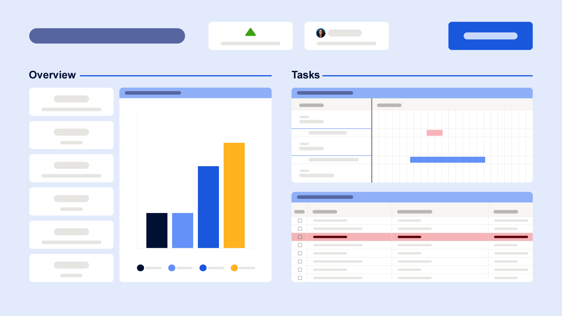
And just in time for a sidequest (this one won’t be boring — I swear!). While our previous blog post dove deep into the rich tapestry of color palettes, this installment of our design-focused series is going to take a wild detour into the unknown… Where you’ll discover dashboard design tools you probably never knew were right at your fingertips. And not the “Meh, I already knew that” kind of stuff… It’s going to be the “*scrunches face* No way, really!?” kind of stuff. So let’s go!
Horizontal lines (and no, I’m not talking about using the image widget)
Yep, like the title says, you’ve been doing horizontal lines all wrong. I know, because I, too, used to use the image widget to upload JPEGs of horizontal lines. It does the job, but there are definitely some challenges and trade-offs with this approach, especially when it comes to widget padding and optimizing your dashboard’s overall look and feel.
Realizing there’s been a better way this whole time may be hard to swallow, but once you see it, there’ll be no turning back.
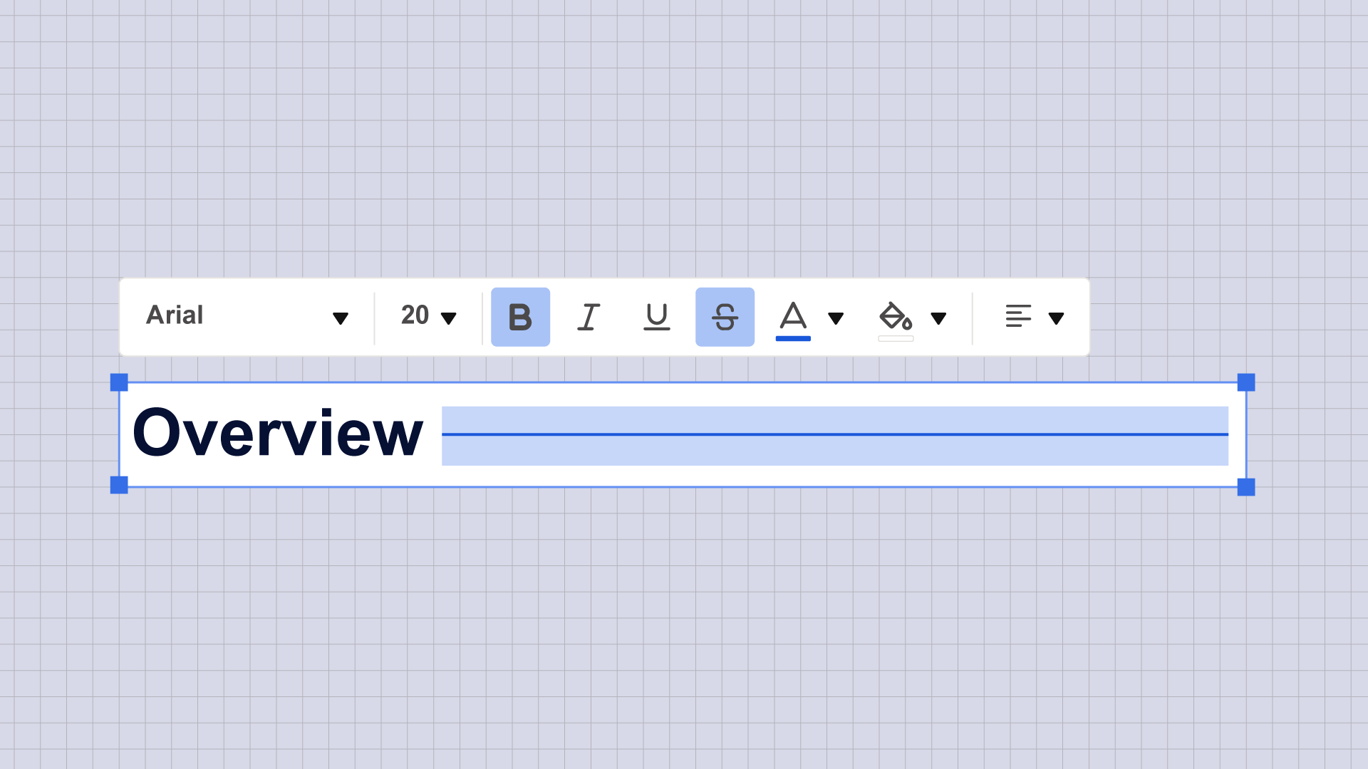
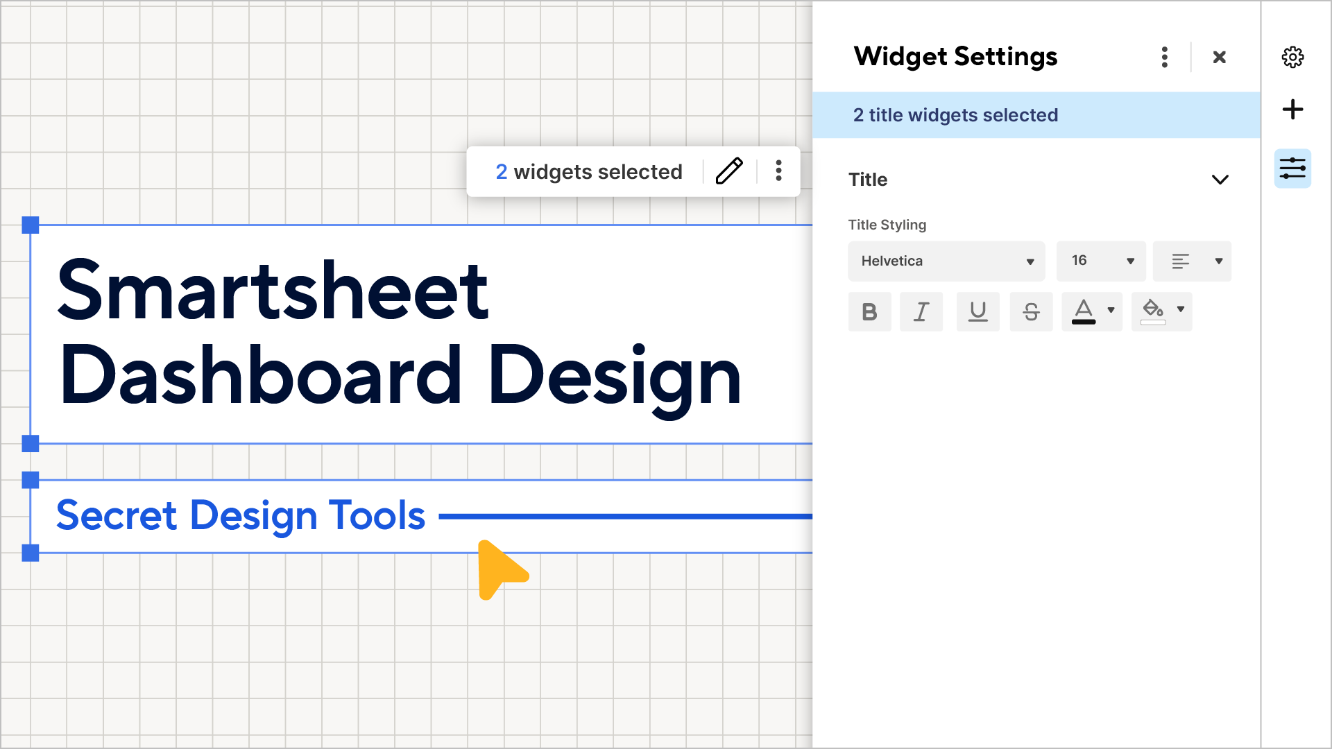
Strikethrough. That’s it. For the crispest horizontal lines, create a title widget, select strikethrough, and tap the space bar until your line is the desired length. Voilà!
Unlike the line you might create with an image widget, you can change the color of a strikethrough line the same way you would change the color of text. And in dashboards, you have a full hex palette of colors to choose from, so you can make your horizontal divider line any color you’d like, right on your dashboard. And because it’s a title widget, you can put your section title and divider line in the same widget, saving valuable real estate on your dashboards.
You can unscrunch your face now.
Realtime symbols (not using a chart)
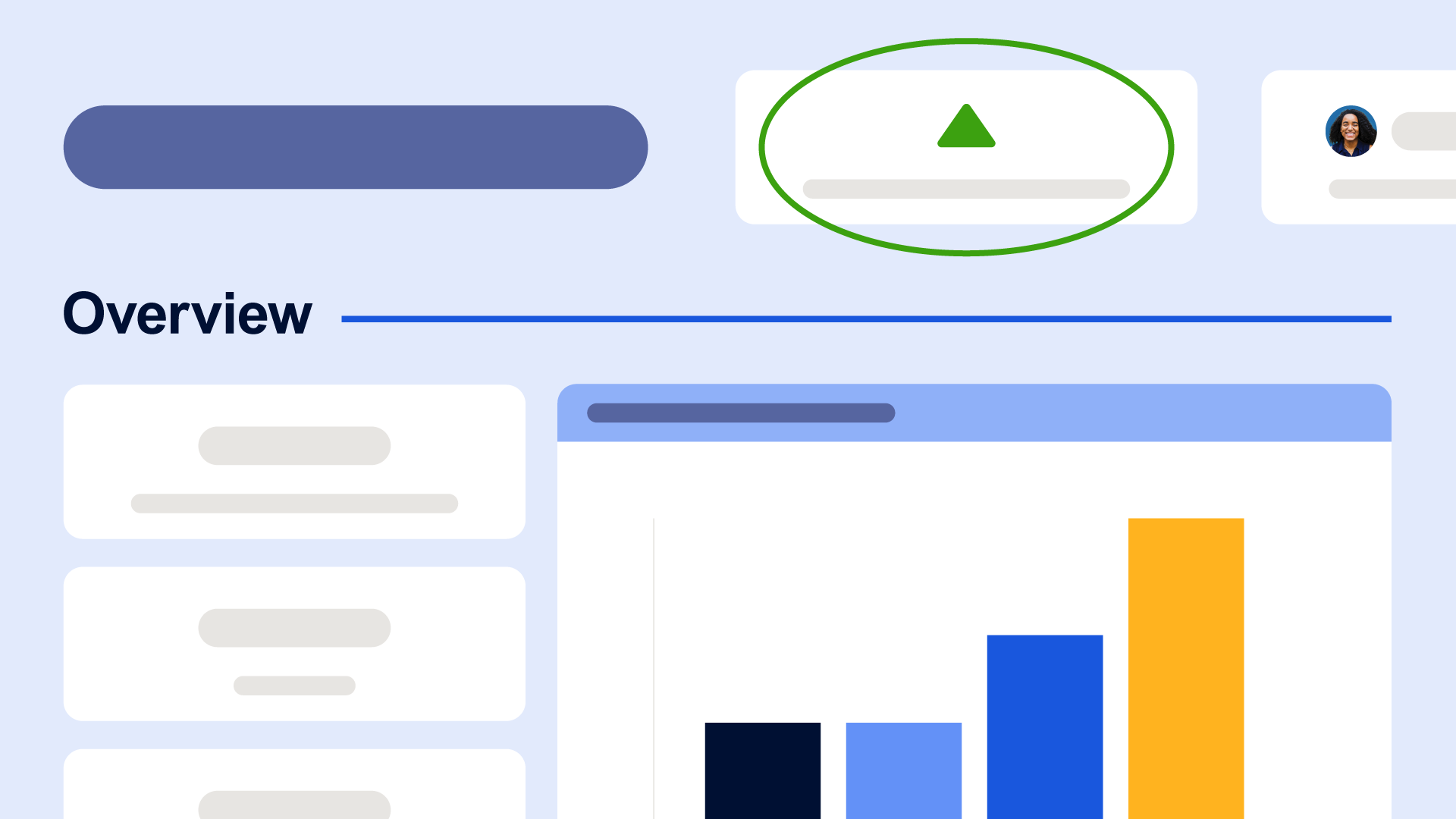
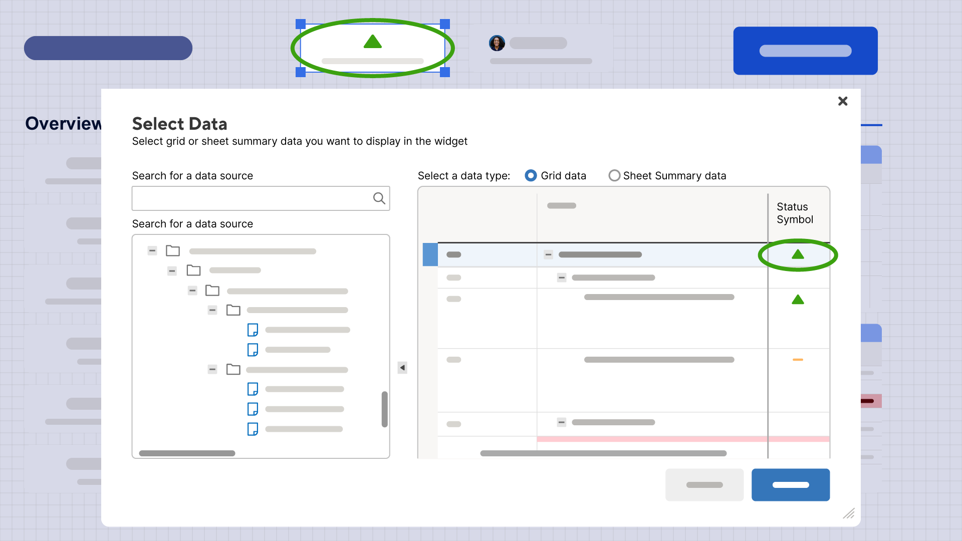
Another secret tool in dashboard design is the strategic use of symbols to convey information quickly and effectively. While the metric widget is the mechanism that brings these symbols from your sheets to your dashboard, the true power is in the symbols themselves.
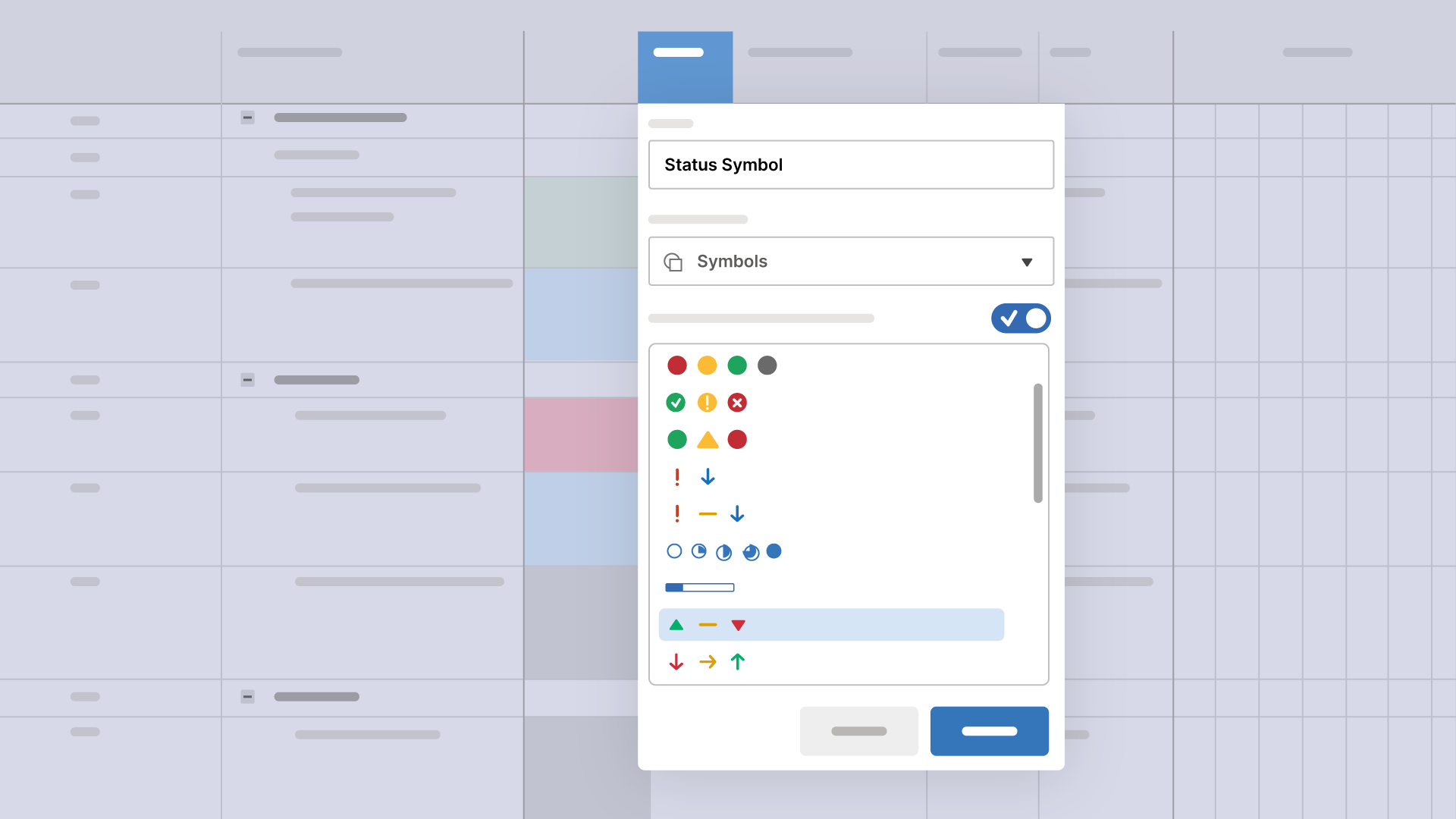
For instance, employing intuitive symbols like the green up-arrow for positive trends, the yellow neutral line for stability, or the red down-arrow for areas needing attention, can transform your dashboard into an instantly readable map of your project’s status. All it takes is a little formula magic on your sheet. Then pick the indicator you want to show up on the dashboard using the metric widget. Boom.
The beauty of this approach is the freedom to choose from an extensive range of symbols that Smartsheet offers (and if you want to get really wild, you can even head down the rabbit hole and learn how to embed emojis 😎 and a ton of other symbols). With either approach, this dashboard design tool gives you the ability to customize your dashboard to precisely reflect your project’s narrative. This method goes beyond mere data display; it’s about crafting a visual story that speaks volumes at a glance.
Edit multiple widgets at the same time
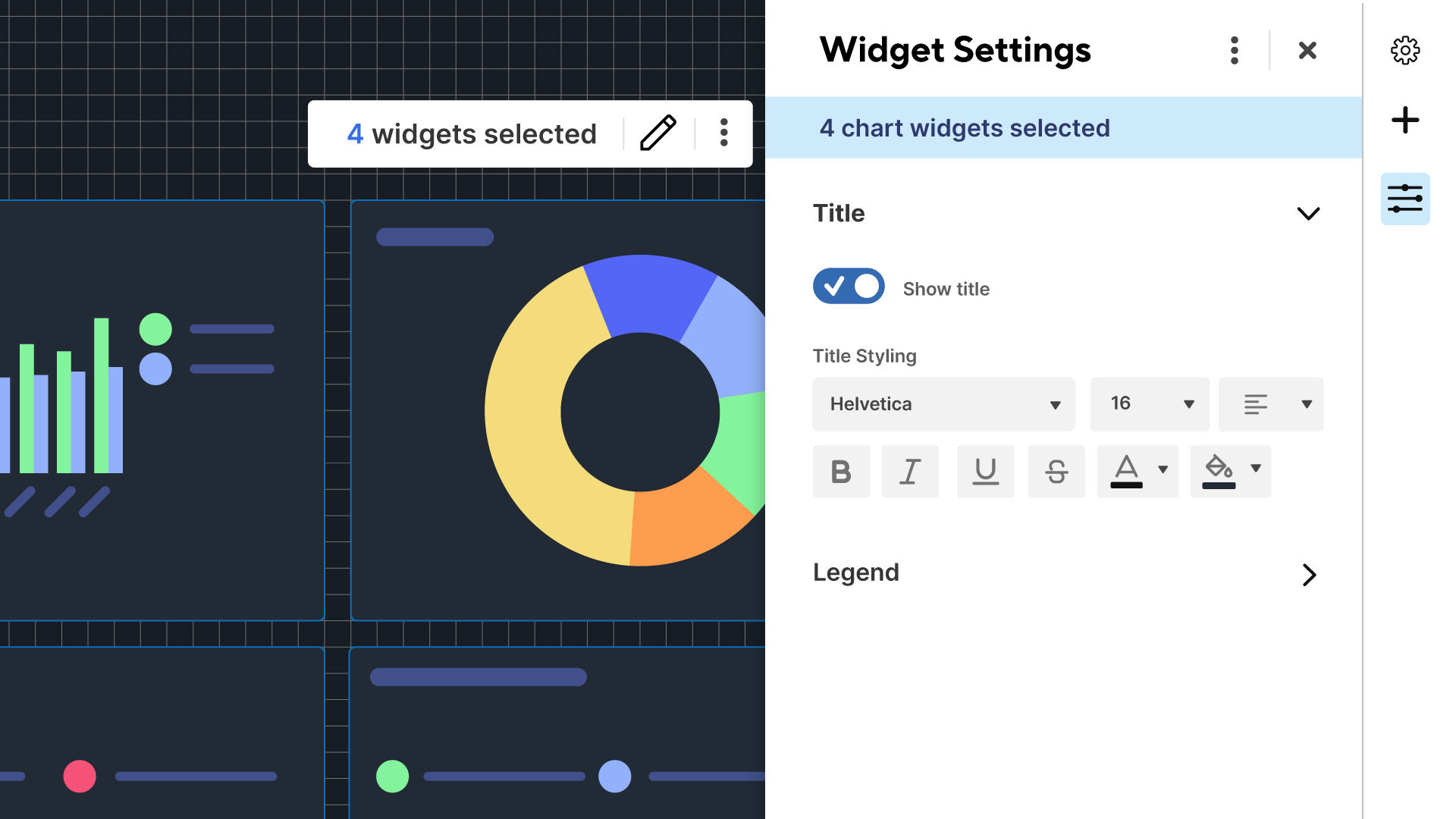
Okay, this hot tip is sort of cheating a little since multi-widget editing just came out. But you probably didn’t know you could do this yet, and it’s an absolute game changer when it comes to build time, so I’m keeping it on the list.
Need to update a bunch of chart fonts for consistency? No problem. Want to change the background color of the title in a few of your widgets? You got it. With multi-widget editing you can make either of these changes with just a few clicks. Which means you can update the look and feel of your entire dashboard super quickly.
Contact cards and clickable email addresses (this one’s a twofer!)
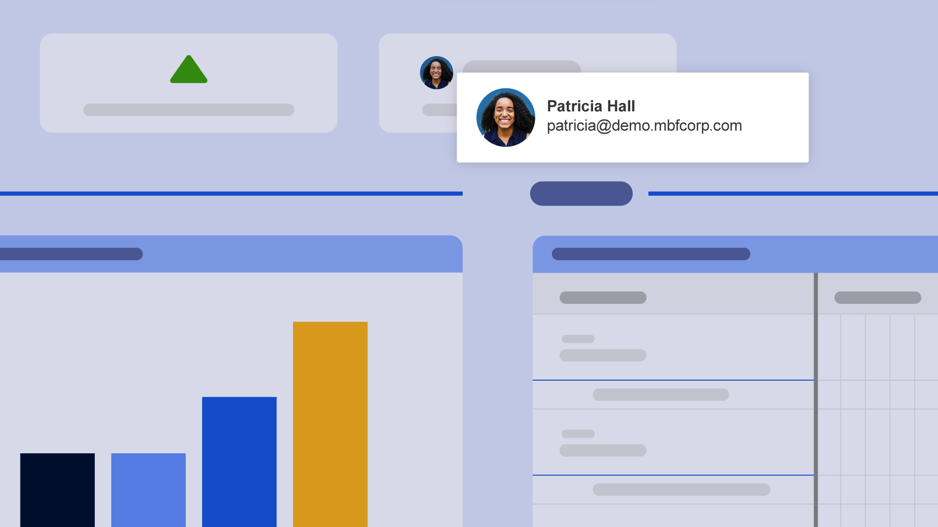
Another hidden gem in your secret toolbox, especially for those using the contact column in their sheets, is the ability to prominently display contacts on your dashboard using the metric widget. This nifty feature not only enhances the visual appeal of your dashboard, but also brings practical utility.
When you integrate the contact column into your dashboard through the metric widget, each contact is not just a static entry. The real magic happens when you view the dashboard: Simply hover your cursor over a contact, and ta-da! The email address associated with that individual is seamlessly revealed.
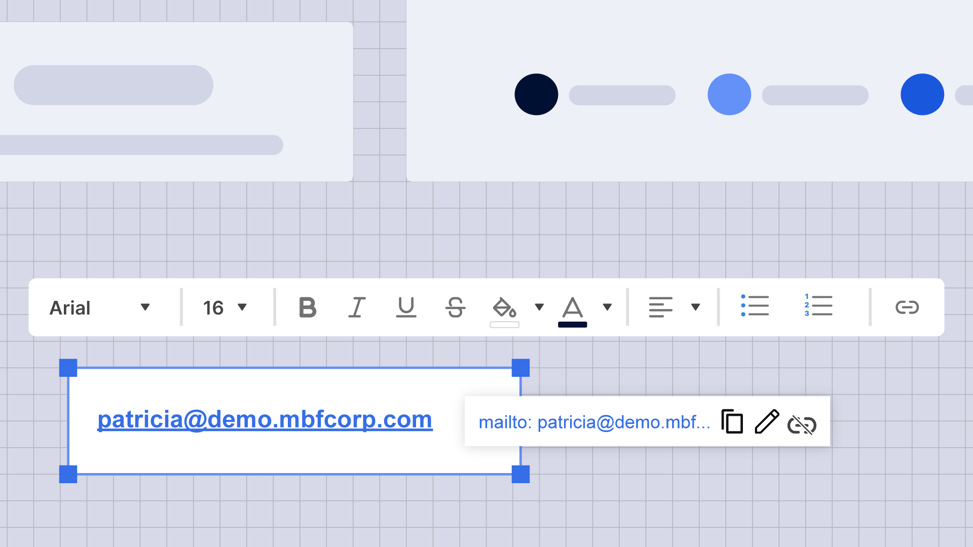
If you want to go the extra mile, you can also create a mailto link using the rich text widget, so that when dashboard viewers click on the email address, it opens their default email client and they can quickly send an email to that address. This feature is particularly useful for projects where quick communication is key, as it eliminates the need to navigate away from the dashboard to retrieve contact information. It's a small but mighty function that many users overlook, and it contributes significantly to a more efficient and interactive dashboard experience.
You’ve completed the sidequest!
We’ve taken you on a wild detour through the secret world of dashboard design, uncovering hidden gems and overlooked tricks that can truly transform your dashboard-building game. From creating crisp horizontal lines with strikethrough text to using symbols to convey information at a glance; from game-changing multi-widget editing to the practicality of contact cards and clickable email addresses, digging deep into your design bag to pull off these tricks will absolutely take your dashboards to a whole new level.
So, the next time you embark on a dashboard design adventure, remember these secret design tools. It’s not just about widgets and data; it’s about crafting a visual narrative that tells your project’s story. Embrace these tools, experiment, and watch your dashboards come to life in ways you never imagined. Oh, and I almost forgot — make sure to bookmark the dashboard design guide so you’re always up-to-date on the latest Smartsheet dashboard design best practices.
Go get it!
