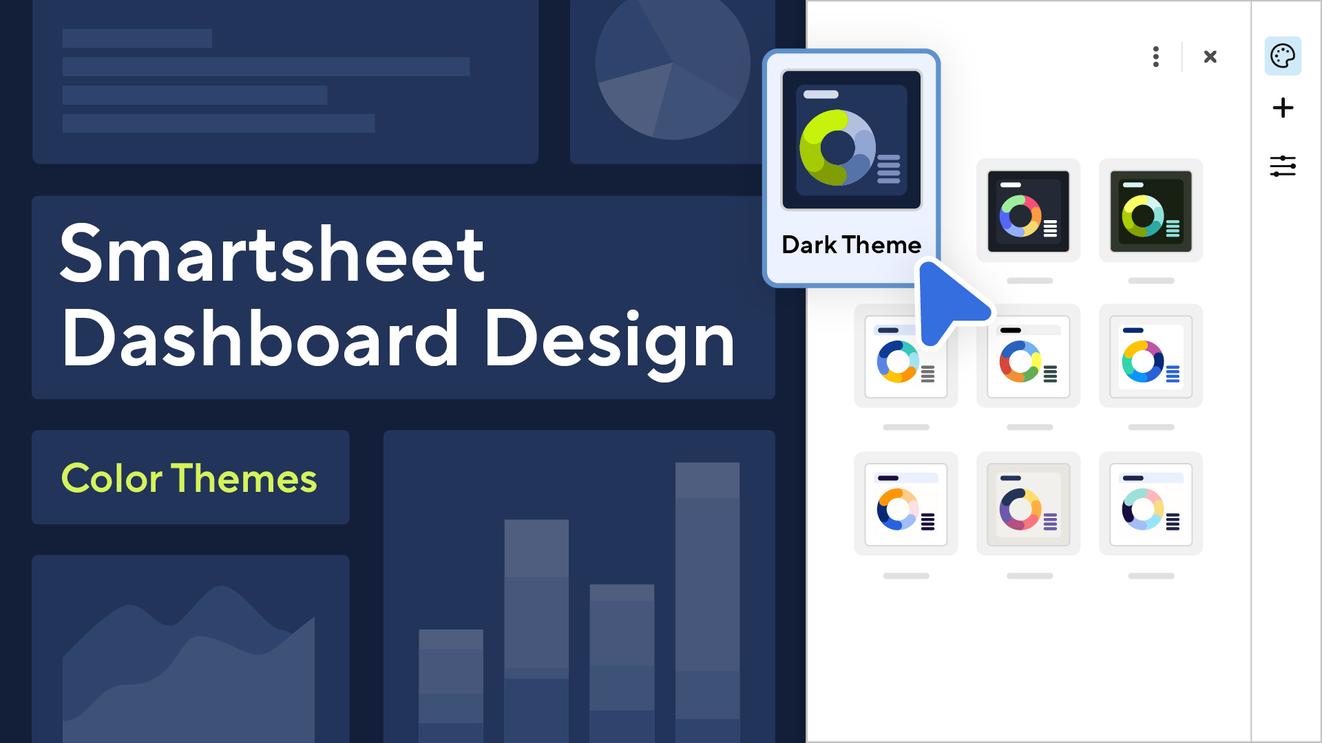
Our vibrant journey through dashboard design continues…
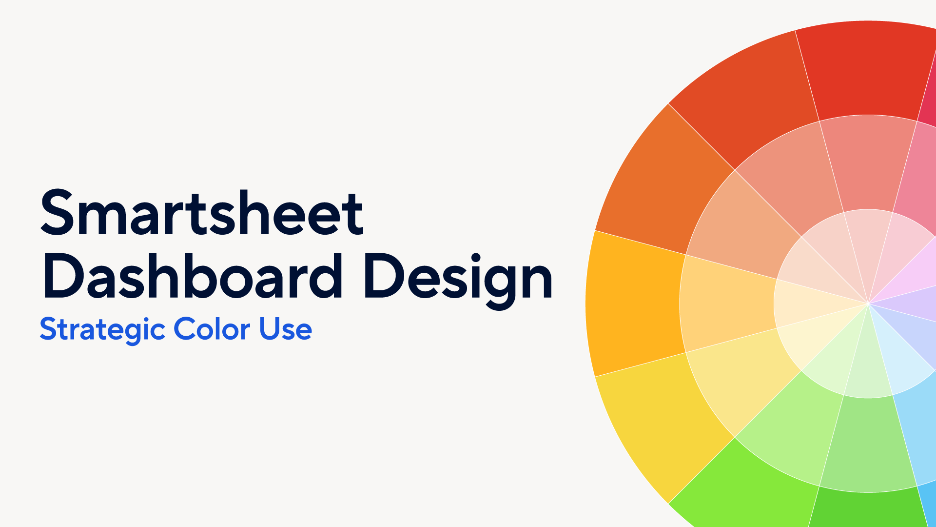
If you’ve been following along, you’re already a wizard with colors and secret design tools, and you understand how they can transform your dashboards from purely functional to stunningly effective. Today, we’re not just moving forward; we’re taking a leap into a world where strategic color use meets palette building, with a special reveal that’s bound to make your day.
In this latest installment, we're showcasing brand new dashboard color themes that have been meticulously crafted using the principles we’ve unpacked in our series opener. These aren’t just any themes; they’re a testament to the power of thoughtful design, ready to bring your data to life in ways you’ve only imagined.
But here’s the best part — these stunning new color themes are now available in Smartsheet, ready for you to explore and implement. That’s right — you can now easily infuse your dashboards with more personality and professionalism, all with a few clicks. And just in case you were wondering, we’re not stopping there. We’re working on theme customization and, ultimately, plan standardization. More to come on that at a later date.
For now, let’s dive into each new theme, unpacking the design choices and showing you how those collective choices deliver objectively awesome dashboards. Let’s embark on this colorful adventure together and unlock the full potential of your dashboard designs!
Release the color themes!
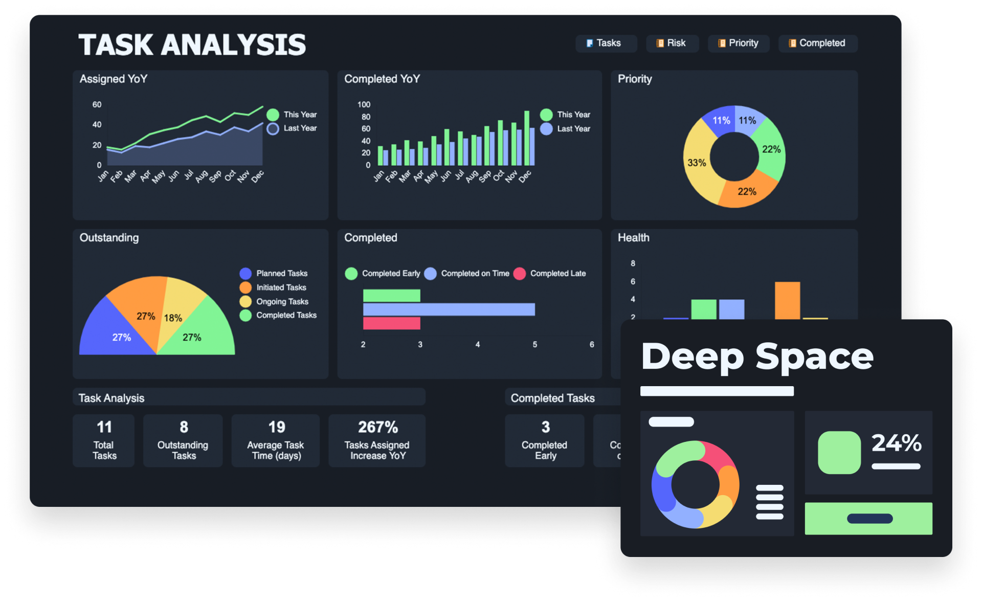
Deep Space
Overview
The “Deep Space” color theme redefines the dark mode experience for Smartsheet dashboards, artfully blending the serene depth of a dark background with the vibrant vitality of a tetradic color scheme. This sophisticated approach selects colors that are equidistant on the color wheel, creating a palette that is as harmonious as it is dynamic. The result is an aesthetic that captivates the eye and enhances legibility and interaction with the data presented. The strategic use of vibrant colors set against a deep, rich backdrop ensures that every element on the dashboard is not merely visible but truly resonant, turning data visualization into an immersive experience.
Scheme
“Deep Space” leverages the tetradic scheme to introduce a rich contrast and variety without compromising on coherence or visual comfort. The vivid colors are chosen for their ability to stand out against the dark background, making critical information pop and facilitating a seamless navigation through complex datasets. The “Deep Space” theme thus combines visual appeal with practical functionality, ensuring that dashboards are not only easy on the eyes during extended viewing periods but also effective in communicating key insights.
Use
Embracing the “Deep Space” theme for your dashboards means inviting a sense of exploration and discovery into your data analysis, akin to the infinite expanse of the cosmos. It’s designed for those who seek to elevate their dashboards beyond mere functionality, offering a visually stunning and engaging interface that enhances the storytelling power of data. This theme is a testament to the idea that with thoughtful design, dashboards can become captivating windows into the universe of information they represent, making every insight a discovery and every interaction an adventure.
Full color palette including hex codes
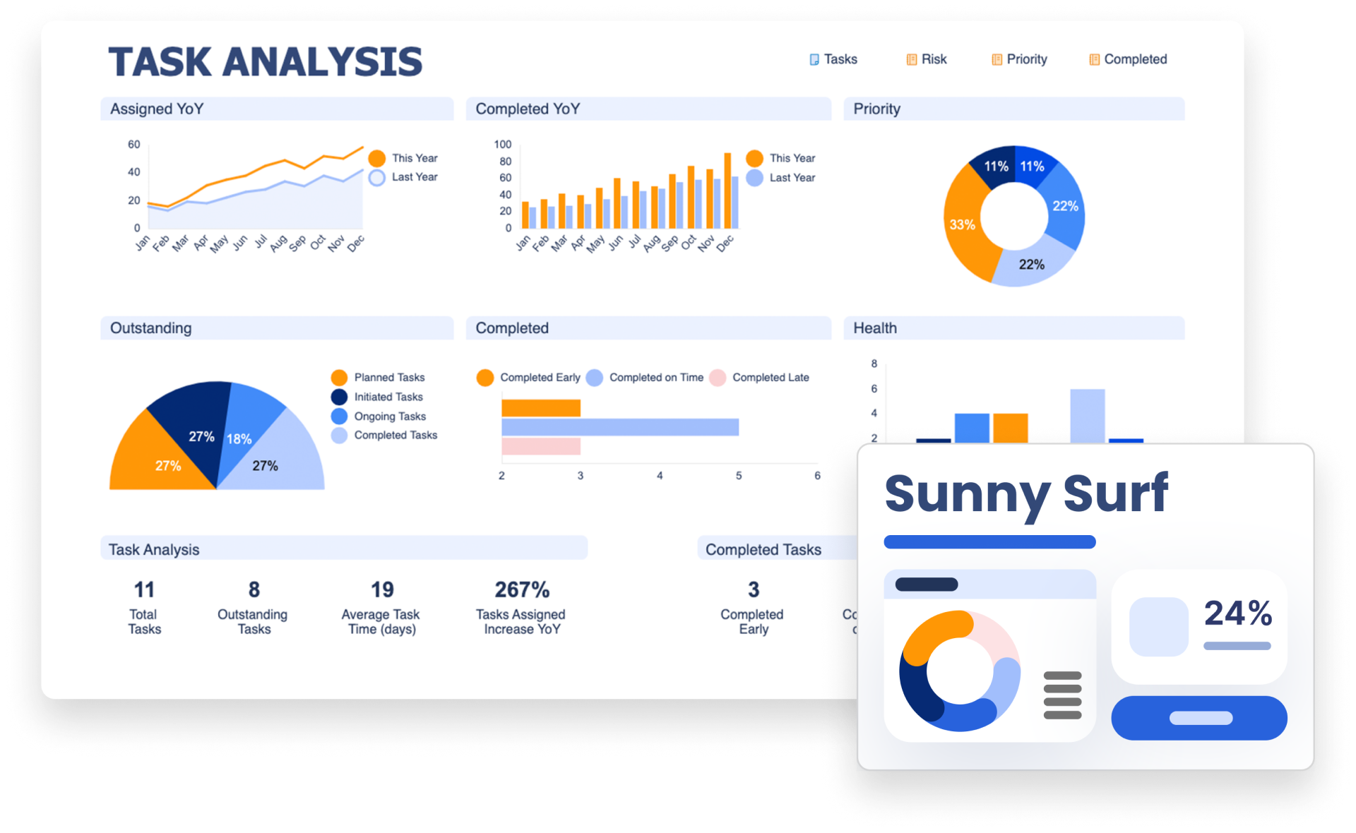
Sunny Surf
Overview
The “Sunny Surf” color theme embodies the vibrant, invigorating spirit of summer beaches, making it the perfect backdrop for dashboards that aim to energize and inspire. By leveraging a complementary color scheme that combines the lively hues of bright blue and orange, this theme injects a sense of warmth and vitality into data visualization. This intentional pairing does more than just please the eye — it captures a sense of energy and excitement, and the liberating feel of sunny days by the surf.
Scheme
In the world of design, complementary colors sit directly opposite each other on the color wheel, and it’s this relationship that “Sunny Surf” capitalizes on to create its striking visual contrast. The bright blue evokes the refreshing and boundless ocean, while the vibrant orange mirrors the joyful glow of the sun, together producing a balance that’s both visually engaging and harmonious. This contrast not only makes the dashboard more appealing but also significantly enhances the clarity and readability of information, making key data stand out effectively.
Use
Adopting the “Sunny Surf” theme for your Smartsheet dashboards means choosing a design that is as impactful as it is beautiful. It’s an invitation to bring the dynamic and uplifting energy of summer into your projects, transforming the way data is presented and interacted with. This theme is particularly suited for projects that benefit from a lively, positive atmosphere, encouraging users to engage with data in a more connected and meaningful way. “Sunny Surf” demonstrates the power of color in creating a compelling narrative for your data, making every interaction not just informative, but also a delightful experience.
Full color palette including hex codes
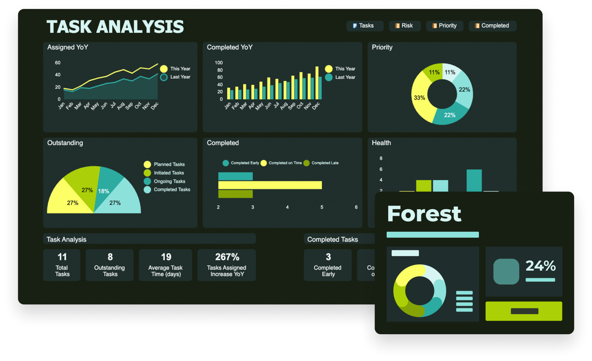
Forest
Overview
The “Forest” color theme offers a soothing and visually harmonious experience, reminiscent of a peaceful forest at dawn. It employs an analogous color scheme, seamlessly blending varying shades of green with vibrant yellow accents. This thoughtful combination captures the essence of tranquility and relaxation found in nature, while also ensuring that crucial elements stand out with a pop of brightness. The greens, reminiscent of foliage and the freshness of the morning, create a backdrop that’s not only easy on the eyes but also conducive to focus and calm.
Scheme
Incorporating these shades of green alongside yellow highlights follows the principle of using colors that are close to each other on the color wheel, promoting a sense of unity and balance in the design. This analogous approach ensures that the dashboard maintains visual coherence, enhancing the user’s ability to process and interact with the information presented. The yellow accents, carefully chosen for their vibrancy, act as beacons of light within the verdant palette, guiding the viewer's eye to the most pertinent data or insights.
Use
Applying the “Forest” theme for your dashboards can transform the user experience, making it more engaging and restful. This theme not only makes it easier for users to spend prolonged periods interacting with data but also imbues the digital space with the natural aesthetics of a forest landscape. It’s an invitation to bring the outside in, creating a work environment that feels more connected to the natural world and fostering productivity, creativity, and a sense of well-being.
Full color palette including hex codes
Rainbow
Overview
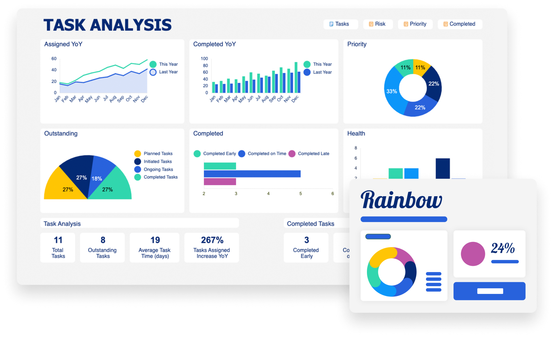
The “Rainbow” color theme embodies the essence of playfulness and beauty through its simple yet elegant use of a spectrum of colors, adopting a tetradic color scheme to craft a harmonious and eye-catching visual arrangement. This theme captures the joyful and positive spirit of a sunny day adorned with a rainbow, where each color transitions smoothly to the next, creating a vibrant yet balanced display. The tetradic scheme, characterized by the use of four colors that are evenly spaced around the color wheel, ensures that the “Rainbow” theme offers a dynamic range of hues while maintaining a cohesive look that’s pleasing to the eye.
Scheme
This deliberate choice of a wide-ranging palette not only evokes a sense of refreshment and delight but also provides a unique opportunity to highlight various elements within the dashboard. The diverse colors work together to draw attention to key data points and metrics, making the dashboard not just a tool for information but a canvas for visual storytelling. The “Rainbow” theme’s strength lies in its ability to blend the vibrancy of multiple colors without overwhelming the viewer, promoting both engagement and comprehension.
Use
Adopting the “Rainbow” theme transforms your dashboards into spaces that are not only functional but also inspirational. It encourages a more enjoyable interaction with data, fostering an environment where creativity and positivity thrive. This theme is perfect for projects that aim to inspire, motivate, and uplift, turning the mundane task of data analysis into an experience that’s as enriching as it is informative. The “Rainbow” theme demonstrates that with thoughtful design, dashboards can be more than just practical; they can be a source of joy and inspiration.
Full color palette including hex codes
Starry Night
Overview
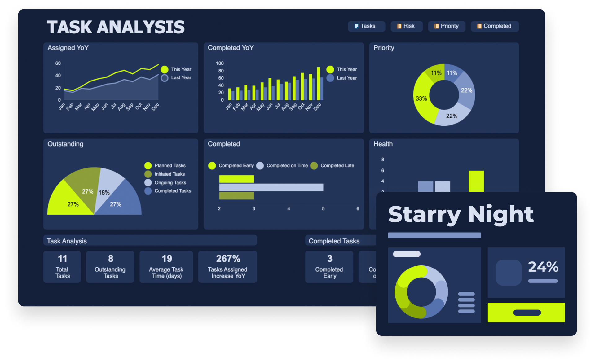
The “Starry Night” color theme draws inspiration from the iconic painting, blending artistry with functionality in dashboard design. By employing an analogous color scheme, it marries a deep blue background with shades of lime green, evoking the enchanting contrast and vibrant energy found in the masterpiece. This carefully chosen palette not only captures the painting’s essence but also ensures that the dashboard is readable and remains comfortable for the eyes.
Scheme
The use of dark blue serves as the perfect backdrop, akin to the night sky, while the lime green shades add depth and dimension, mirroring the swirling, dynamic strokes of the painting. This approach creates a visually appealing contrast that enhances the user’s focus and engagement with the data presented. The analogous scheme, focusing on colors closely related on the color wheel, ensures a harmonious transition between hues, offering a sense of calm and continuity reminiscent of the painting’s captivating night scene.
Use
Incorporating the “Starry Night” theme into your dashboards brings an element of classic artistry to the digital realm, transforming data visualization into a visually stunning experience. It’s an invitation to blend creativity with analytics, offering users not just a tool for insight but a canvas that sparks joy and inspiration. This theme is ideal for those looking to infuse their dashboards with a touch of elegance and historical richness, making every interaction an opportunity to journey through a star-filled night.
Full color palette including hex codes
Pastel
Overview
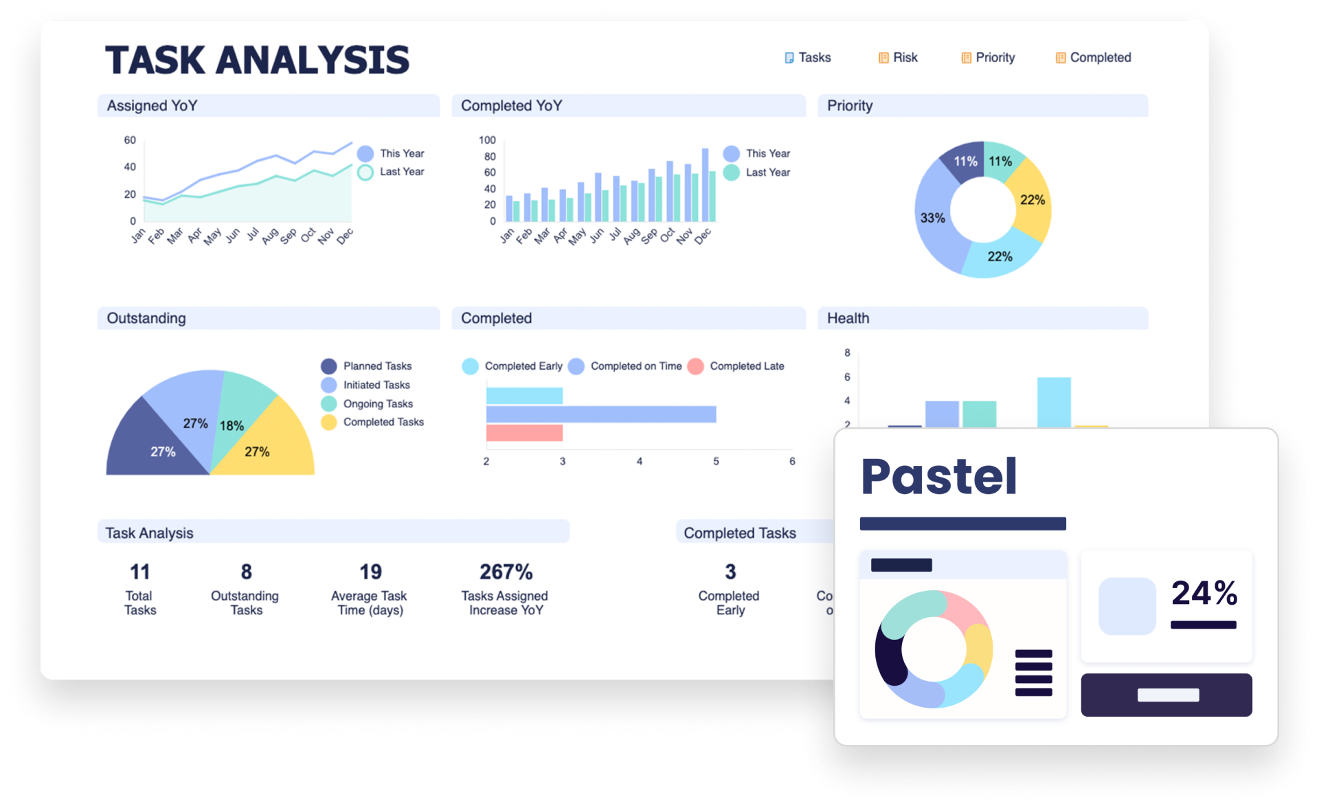
The “Pastel” color theme elegantly combines the full spectrum of hues with a softened touch, employing a tetradic color scheme to create an atmosphere that's as dreamy as it is nuanced. This theme curates a palette of pastel colors, each chosen for its ability to convey a sense of gentleness and serenity, crafting an ambiance that’s visually soothing and emotionally resonant. The pastel tones, with their muted yet full-bodied character, bring a soft, dreamlike quality to dashboards, transforming data visualization into an experience that’s both comforting and aesthetically pleasing.
Scheme
The tetradic scheme in “Pastel” plays a crucial role, carefully balancing four distinct colors to maintain visual interest without overwhelming the senses. This approach ensures that the “Pastel” theme remains harmonious and cohesive, inviting viewers into a serene space where information is presented with clarity and elegance. The choice of pastel hues not only makes the dashboard appealing to the eye but also enhances the user’s emotional connection to the data, facilitating a more engaging and meaningful interaction.
Use
Adopting the “Pastel” theme for your dashboards is an opportunity to embrace subtlety and sophistication in data presentation. It’s perfect for projects that benefit from a gentle, inviting atmosphere, where the visual experience complements the depth of the insights offered. This theme demonstrates that powerful data visualization can be achieved not only through bold colors and sharp contrasts but also through the delicate and thoughtful application of softer tones, making every dashboard not just a tool for analysis but a powerful work of art.
Full color palette including hex codes
Retro
Overview
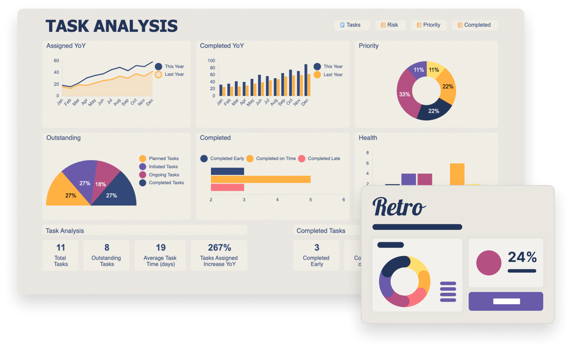
The “Retro” color theme is a creative homage to the nostalgic charm of yesteryears, thoughtfully crafted through a tetradic color scheme that melds the warmth of muted tones with the distinctiveness of vintage aesthetics. This theme selects a palette that blends hues of yellow, plum, and dark blue, each contributing to an atmosphere that is both warm and inviting, encapsulating the essence of coziness reminiscent of a bygone era. The combination of these colors not only creates a visually appealing contrast but also evokes a sense of familiarity and comfort, inviting users into a space where data presentation is infused with a touch of retro flair.
Scheme
In employing a tetradic color scheme, “Retro” skillfully balances four colors to ensure a dynamic yet cohesive visual experience. This approach allows for a rich interplay between the colors, enhancing the dashboard’s ability to capture attention while maintaining a harmonious aesthetic that’s easy on the eyes. The chosen hues — yellow for its brightness and optimism, plum for its depth and sophistication, and dark blue for its stability and strength — work together to create a palette that is both versatile and emotionally resonant.
Use
Adopting the “Retro” theme for your dashboards offers an opportunity to blend the analytical with the aesthetic, turning data visualization into an experience that’s not just informative but also deeply engaging. It’s ideal for projects that aim to stand out with a distinct style, offering a sense of warmth and nostalgia that enriches the user’s interaction with the data. The “Retro” theme demonstrates how a thoughtful application of color can transform the mundane into the memorable, making every dashboard a journey through time that’s as informative as it is visually captivating.
Full color palette including hex codes
Standard
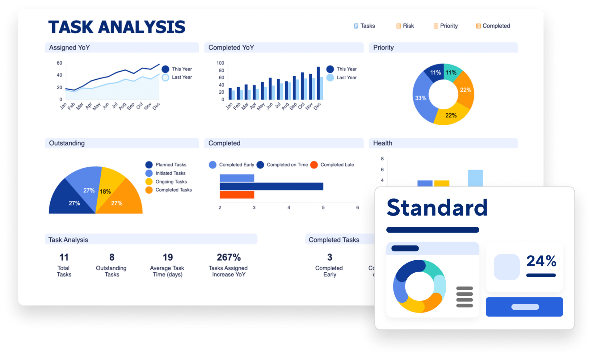
Overview
The “Standard” color theme is a testament to the commitment Smartsheet has to versatility and visual appeal. This theme is designed to suit a wide variety of projects, from websites and data visualizations to informational intranets. It masterfully combines simplicity with a dash of playfulness, incorporating a vibrant color palette that adds a lively yet refined touch to designs, while ensuring the overall look remains clean and visually appealing.
Scheme
Crafted around a tetradic color scheme, “Standard” uses four carefully chosen colors that work in harmony to create a dynamic and engaging user experience. This selection enriches dashboards with depth and contrast, highlighting key information without overwhelming the viewer. The interplay of colors is optimized for readability and user engagement, making it easier for viewers to navigate through data and grasp essential insights at a glance.
Use
Choosing the “Standard” theme for your Smartsheet dashboards means opting for a design that is both functional and aesthetically pleasing. It’s perfectly aligned with the needs of professionals seeking to blend creativity with clarity in their projects. This theme demonstrates the impactful role of color in making information compelling and accessible, ensuring that every dashboard serves its purpose by enhancing the visual story of your data.
Full color palette including hex codes
New levels of aesthetic appeal and effectiveness unlocked!
And there we have it — a whirlwind tour of our latest dashboard color themes. We hope this journey has inspired you and equipped you with fresh, exciting ways to present your information with flair and precision.
Remember, these new themes are more than just a random collection of colors; they’re a bridge to more engaging, professional, personalized dashboards. We encourage you to experiment, mix and match, and find the perfect palette that resonates with your project’s spirit and your organization’s identity.
Thank you for joining us on this colorful adventure. We can’t wait to see how you bring these ideas to life in your dashboards, transforming data into captivating stories. Stay tuned for more insights and innovations designed to help you manage your work with unmatched style and efficiency. Until next time, keep creating, planning, and making your dashboards shine!
