Editor's note: This post was published during world-class sailor Pip Hare's 2020-2021 Vendée Globe competition. The solo, non-stop round-the-world yacht race set sail Sunday, Nov. 8, and Pip achieved her dream in February 2021 when she crossed the finish line.
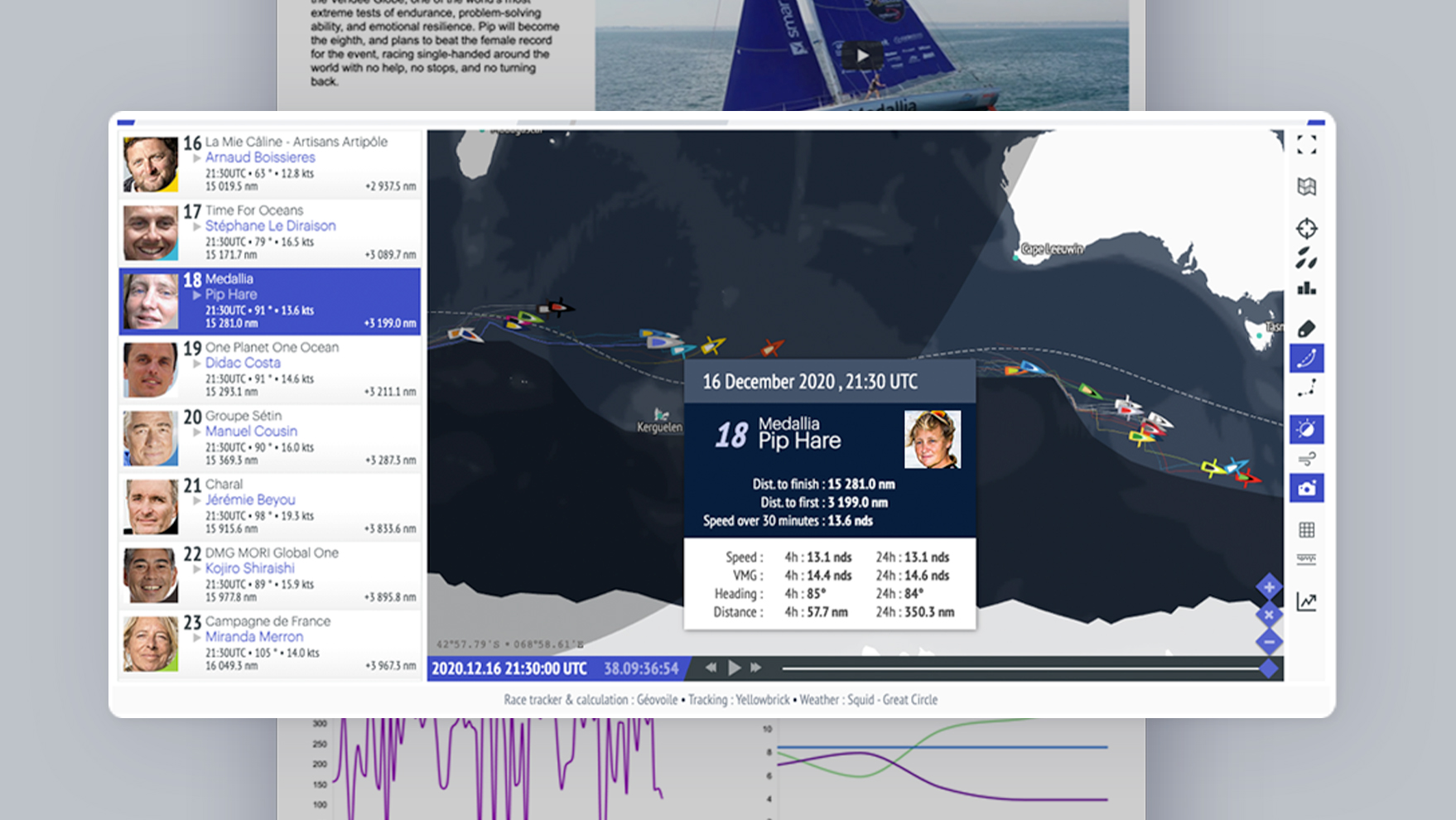
How do you take your fans along with you on a solo, nonstop, round-the-world journey? In November 2020, Pip Hare embarked on her Vendée Globe adventure. As she approaches some of the remotest parts of the world’s waterways in the Southern Ocean, fans can track her location, boat stats, and health metrics in real time, via her Vendée Globe Smartsheet dashboard.
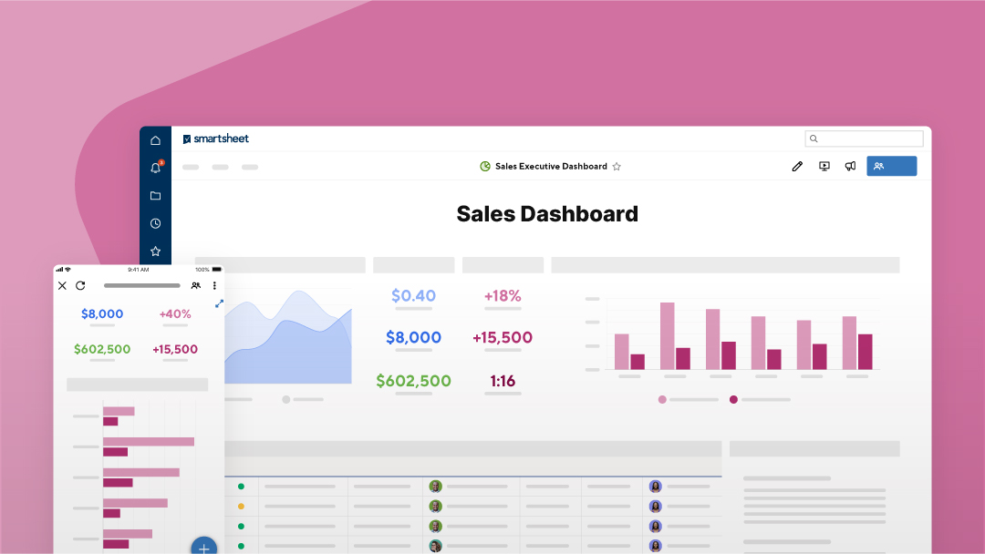
Dashboards can provide a quick and seamless way to offer your audience compelling and engaging information. Whether your audience includes executives who need to know how a marketing campaign is performing, or you’re an athlete wanting to share your progress and performance with fans, you can put together a dashboard — typically within a couple hours and without any coding experience.
In Pip’s case, her dashboard goes beyond simply providing real-time data. For those of us who are new to the sport of competitive sailing, the dashboard provides information on the Vendée Globe race. It also includes a video for us to learn more about Pip and her dream of competing in the race. Ever since she was a young girl, Pip wanted to sail in the Vendée Globe. And in doing so, she is empowered and determined — to challenge the status quo, refusing to allow others’ assumptions to hold her back.
A variety of features creates endless opportunities
To bring information to life, Pip’s dashboard uses a combination of features. First, it allows her fans to sign up to receive email updates with a Smartsheet form. It also shares important boat metrics — like speed and wind direction — and health stats for fans to track Pip’s performance. But the largest, and most compelling, feature is the real-time Vendée Globe race map. Using the “Web Content” widget in Smartsheet dashboards, Pip’s team was able to embed the race map.
The “Web Content” widget supports a variety of domains for immediate use. By simply including a link to a YouTube video, the URL of a Tableau visualization, or even the link to a Google Slides presentation, you can add a layer of depth and interactivity to a dashboard. With a simple click, people you work with can interact with the content right in the dashboard or get to the important information they need to contribute to a project, without taking an extra step to navigate away to the material (and risk not returning).
In the case of Pip’s dashboard, however, the race map was considered custom content. The sky’s the limit with dashboards, so if you’re a customer and need a custom content integration (like the race map), our team can help — in most cases at no additional cost. If you don’t need a fancy, custom map, you can always embed Google Maps and Bing Maps in your dashboard — these can help people easily navigate to points of interest.
One of the biggest benefits of dashboards, including Pip’s, is the ability to publish. Publishing a dashboard makes it public, meaning anyone with the link is able to access it — whether they’re a Smartsheet user or not. When you publish a dashboard, it can serve as a landing page — you just need to provide people with the link. This gives you the ability to make key information public without any code experience needed or web development required.
Dashboards also have a “Report” option should your dashboard need to include a report, which helps you to work with data from multiple sheets within a single view. Presenting report information on the dashboard doesn’t require sharing access to underlying sheets as long as the report and dashboard are published (or you opt to use Dynamic View, a premium app discussed below). That means you can protect sensitive data and manage what gets shared.
Go one step further with premium apps
Smartsheet dashboards also allow you to include visualization and customization with premium apps.
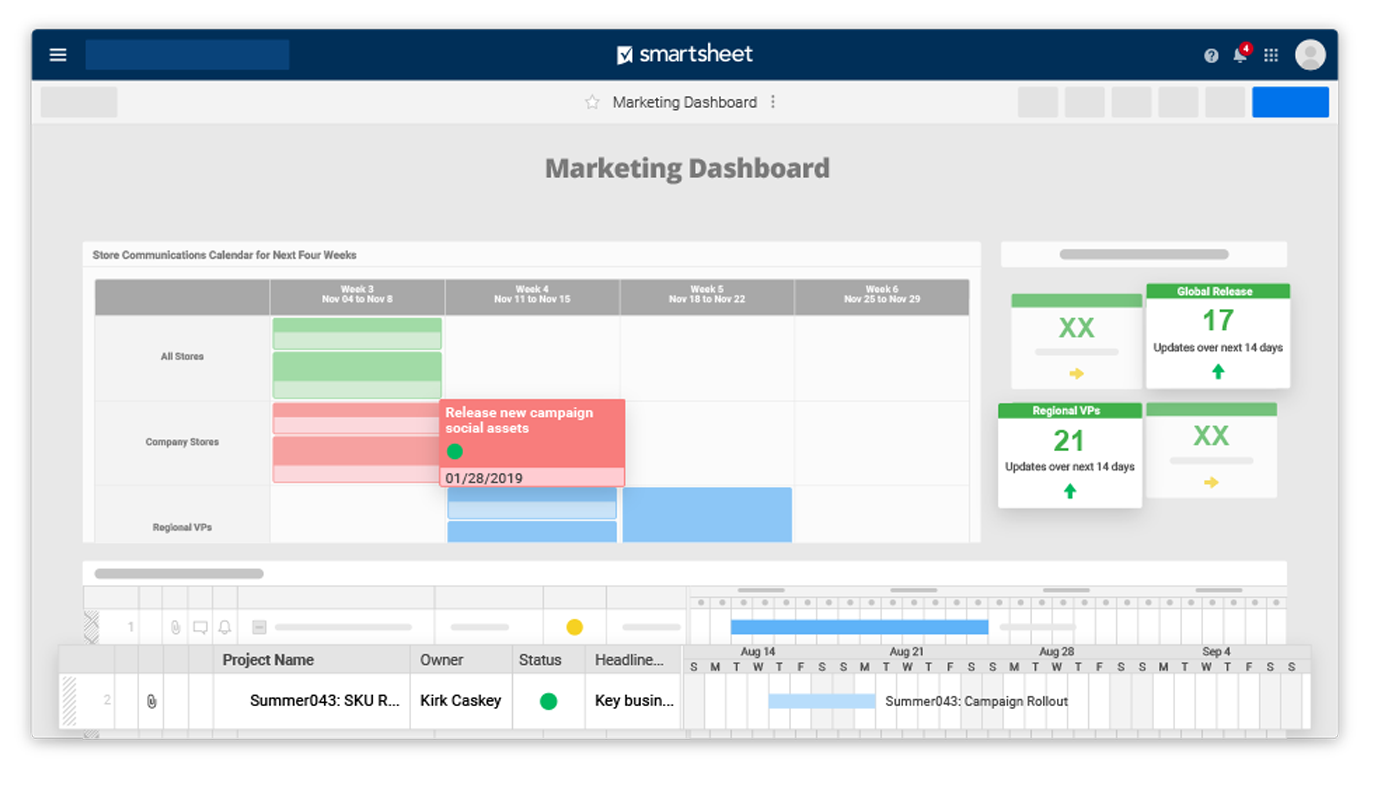
With the Calendar App, you can include a calendar view to highlight milestones, deadlines, or other key dates. If you’re managing a team, you can include project deadlines, time off and holidays, launch dates, and more, so everyone can stay informed.
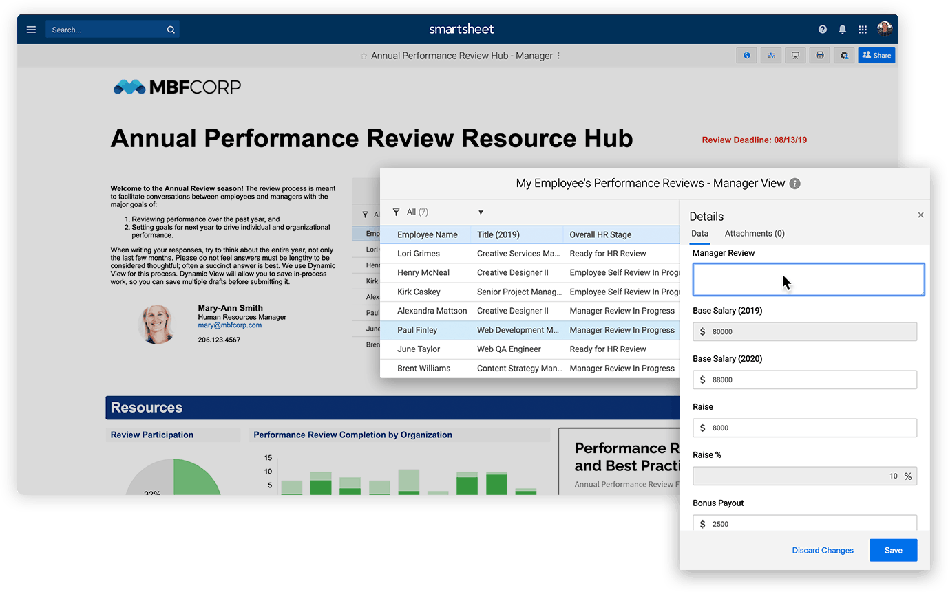
Smartsheet Dynamic View can also be embedded into dashboards. This gives teams the ability to interact with live, actionable, and personalized tasks. Depending on who is logged into the dashboard, Dynamic View can show only the tasks that are relevant to that person.
One perfect example for embedding Dynamic View into dashboards is the performance review process. Employees can see all the general, company-wide information related to the process, but with Dynamic View, each employee sees the key confidential information pertinent to their own performance (e.g. goals, feedback, salary, etc.).
What will you dream up with dashboards?
Dashboards have a variety of use cases, and are flexible enough to handle any challenge. If you’ve never used dashboards before, getting hands-on and experimenting helps the most. Creating a dashboard, trying the widgets, and exploring the different options is the best way to learn. You can always edit it when you think of improvements, or delete it and start fresh.
Our Help and Learning Center has free dashboard resources and guidance, including a webinar series. We also covered dashboards in a recent ENGAGE session to showcase how to increase real-time visibility with stakeholders.
If you have a Smartsheet license and learn best in a live setting, you can sign up for our dashboards-focused instructor-led training.


